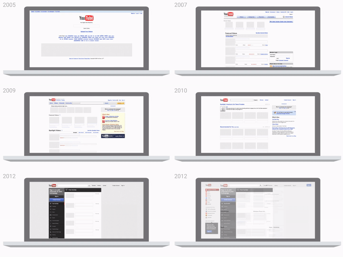
From music to live TV, YouTube has come a long way in the 12 since it launched. YouTube has preserved the same look of the logo for over a long time and now things have changed from its user interface to its official logo. “We felt, because of all that growth, we were missing the mark. We wanted to make something more unified and cohesive, something that really reads as YouTube,” says Bettig. “We were hoping to build a visual language that would make it easy for folks to recognize it.”
“We have the word tube in a tube,” says Christopher Bettig, the head of YouTube’s art department. “This is weird. No one know what this is.” Tube is slang for a television set, which used to be powered by vacuum tubes. But neither tubes nor TVs are central to the world’s biggest video service today, the service is announcing significant changes and new features are on the way.
Starting today, YouTube is rolling out changes to its user interface, along with a new logo designed to keep the “Tube” and onto the familiar play button which has already become an iconic shorthand for the company. On the mobile side, YouTube will support vertical video, giving viewers a full-screen view without having to turn their devices sideways or deal with a really giant black bars on the side which used to be very annoying to users.


